4
Data sources
A Power BI decision dashboard that turns fragmented retail sales data into regional, product and margin insights for weekly management reviews.
This item is used to test the ADE Showcase experience. It is not a real member submission and it does not carry ADE verification.
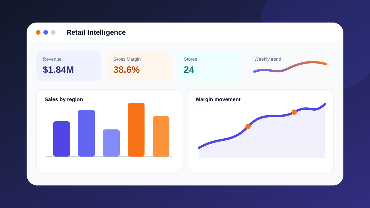
A fictional multi-branch retailer was reviewing sales through separate spreadsheets. Leaders could see totals, but struggled to identify which regions, products and discount patterns were driving margin changes.
The project cleaned and modelled transaction, product and store data, created a star schema, defined KPI measures in DAX, and designed an executive dashboard around revenue, margin, product mix and regional performance. The final story was tested against three management questions rather than built as a chart collection.
The prototype reduced a weekly reporting workflow into a single interactive view and made margin leakage visible by product category and discount band. The sample demonstrates how ADE can present both the finished dashboard and the reasoning behind it.
Star-schema structure and relationship map
Executive view, filters and drill-through flow
Revenue, gross margin, variance and discount measures
One-page summary of the business findings