5
Test participants
A student UX case study redesigning a mobile banking transfer flow for clearer language, stronger accessibility and fewer decision points.
This item is used to test the ADE Showcase experience. It is not a real member submission and it does not carry ADE verification.
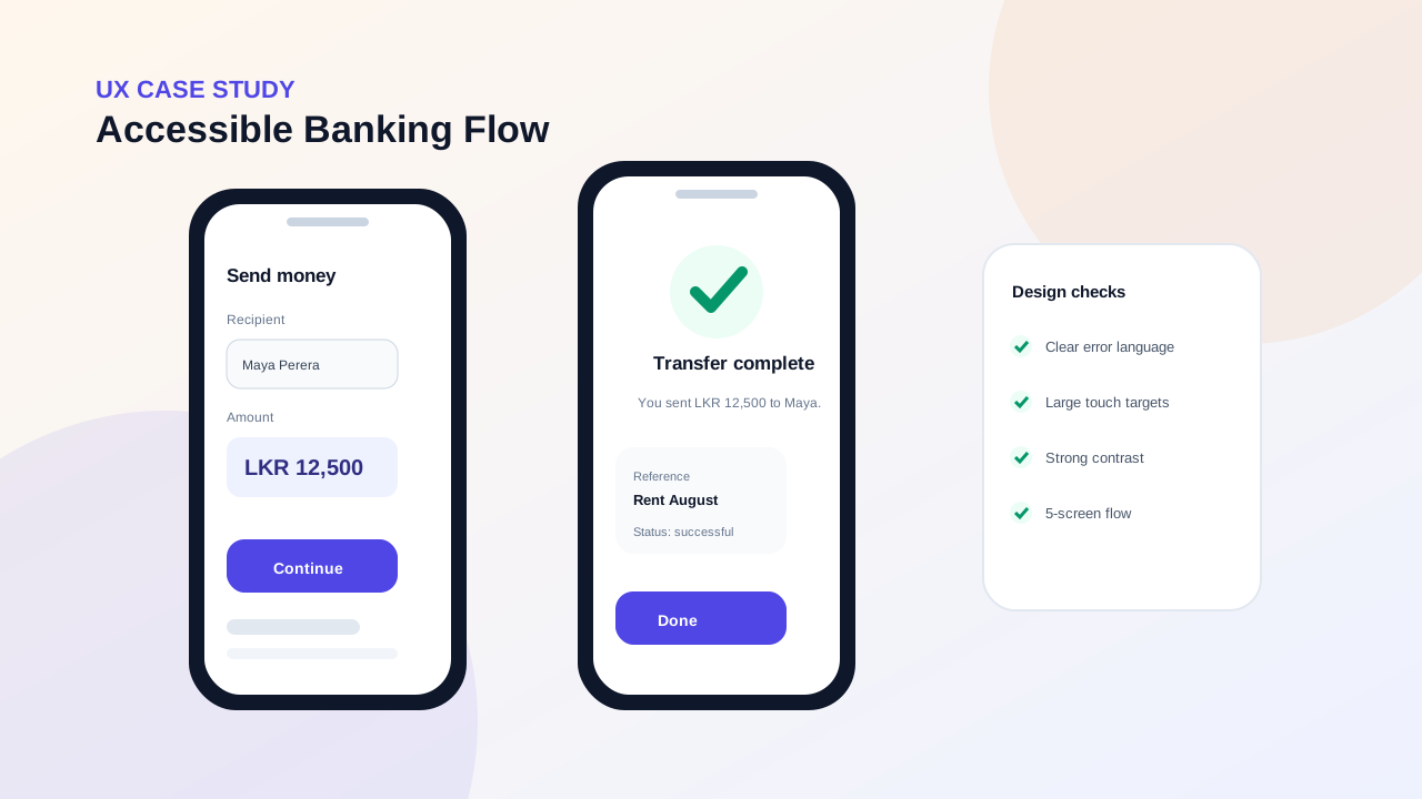
The fictional banking app used dense forms, unclear error states and inconsistent confirmation screens. The design brief focused on improving a common money-transfer journey for users with different levels of digital confidence.
The project mapped the existing flow, interviewed five representative users, documented friction points, created low-fidelity wireframes and then tested a clickable Figma prototype. Accessibility checks were added for contrast, touch targets, labels and error messaging.
The revised concept reduced the transfer journey from seven screens to five, clarified transaction status and made key actions easier to scan. The case study shows research notes, discarded ideas and testing changes, not only polished final screens.
Current-state friction and opportunity areas
Three rounds of flow exploration
Testing observations and design changes
High-fidelity transfer and confirmation flow